Background
Loved by top dermatologists and pediatricians, Canopy creates innovative home wellness devices to help transform homes into the ultimate places for beauty and wellness. Launched in late 2020 with their flagship Bedside Humidifier, Canopy has since expanded its offerings to also include Diffusers and Filtered Showerheads.
Anastasia Postolati leads eCommerce operations at Canopy, overseeing digital merchandising and site changes. She works closely with Canopy’s growth and marketing teams, as well as an external development team.
Challenges
With tremendous growth over the past 18 months, from a single SKU store to a diversified product offering, Canopy recognized the need for an improved and more cohesive eCommerce experience:
Because we were growing so quickly, we were updating the website quickly and frequently based on product needs. But we were missing a critical piece - AB testing - to understand the impact of all of the changes that we were making. We saw the need to learn more about our site and user behavior, and that’s where Visually came in.
Anastasia Postolati - Senior Manager, Ecommerce & Growth
Having tested sparingly with other platforms, Canopy sought a more robust solution. For Anastasia and Canopy, Visually was exactly what they were looking for:
-
User Friendly - with limited technical resources, Anastasia craved a platform that was simple and easy to use - something that could be leveraged internally, without needing to rely on developers.
-
Advanced Functionalities - the ability to customize each component of their store, test third party apps, and tailor personalized experiences to specific audiences
-
Support and Strategy - a team that is not only supportive, but experienced, knowledgeable, and actively recommending test ideas.
Outcome
Canopy has produced some incredible wins with Visually:
UPSELLS & CROSSELLS
For years, Canopy has been using a separate platform to power their product recommendations and upsells, but has spent little time optimizing the design or recommendation engine. It was only a matter of time before they would see how it fared against Visually…
One of the first tests Canopy ran was comparing their traditional upsell to Visually's cart upsell.
The test ultimately revealed that Visually's upsell drove a 6.2% increase in average order value, 9.2% in revenue per session, all without any negative impact on conversion rate. Not only were the results encouraging, but this may eventually allow Canopy to save costs by consolidating all of their upsell and recommendation tools under Visually.
Moving forward, Canopy is continuing to optimize the styling and algorithms of the upsells to determine what is most effective.
.png?width=600&height=600&name=LinkedIn%20Carousel%20Post%20-%20Canopy%20(3).png)
.png?width=600&height=600&name=LinkedIn%20Carousel%20Post%20-%20Canopy%20(1).png)
PERSONALIZED HOMEPAGE
Canopy has been featured by a number of prominent wellness publications and beauty retailers. The logos of these companies are displayed at the bottom of Canopy’s homepage, but specifically for new shoppers, worthy of showcasing higher up the fold.
Visually suggested personalizing the homepage for new shoppers in a way that would highlight the brand’s compelling social proof, all while keeping the same page business as usual for returning shoppers.
The results? A 6.4% uplift in conversion rate. Not too bad!
Now, Canopy will look to optimize the other pages on their site with experiences that are personalized for new shoppers who may need some more information or evidence before making their first purchase.
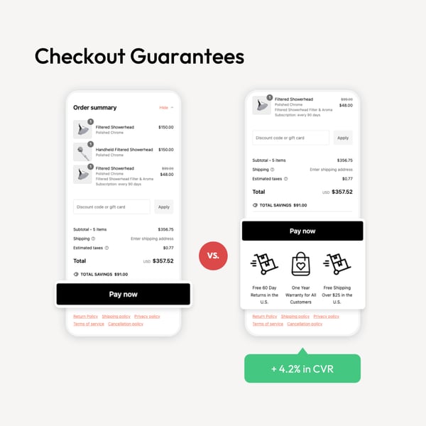
CHECKOUT GUARANTEES
Canopy’s checkout page was historically a bleak and transactional touchpoint.
Not anymore.
With Visually’s checkout blocks, Canopy was able to display a set of icons highlighting free shipping, free returns, and a one year warranty. After a 4.2% increase in conversion rate, it was a no-brainer to establish these checkout guarantees as a core element of the checkout page.
Canopy may seek to further optimize by switching up the location, copy, and even design of these icons.

.png?width=600&height=600&name=LinkedIn%20Carousel%20Post%20-%20Canopy%20(2).png)
TOLSTOY VIDEOS
Canopy uses Tolstoy to add interactive videos to their product pages. This is an excellent way to capture shoppers’ attention and showcase the product’s benefits and use cases.
Without much data to back up their decision, the Canopy team simply placed the videos at the bottom of the description and more information dropdowns. They saw nice improvements to conversion rate, but perhaps this was not the most optimal location for the videos.
Using Visually, they adjusted the placement of the video blocks, moving them just beneath the add to cart button. Indeed, this was a much better position, as Canopy quickly saw a 9.2% increase in conversion rate, and 12.1% increase in revenue per session.
What’s next? Canopy will look to continue optimizing their interactive videos, iterating on location, content, and styling.
Since adopting Visually in March 2024, Canopy has conducted over 100 different A/B tests and experiences. Anastasia has become a power user of the product, adept at building and launching tests, and doing so in just a matter of minutes. Visually’s recently released audiences page has provided Anastasia and her team with deeper insights into their overall site performance, and informed new opportunities for them to optimize further.
Here’s what Anastasia had to say:
Whenever I talk to people about Visually they say: I didn't even know you could do that to a website, that every element just becomes movable or editable. That’s the biggest thing for me - a quick and simple way for us to test internally. Not to mention, the team’s support is just so great. The CRO expert actually bring things for us to think about, along with suggestions to test - they genuinely want to see us grow and succeed.
Anastasia Postolati - Senior Manager, Ecommerce & Growth

