
.png?width=591&height=236&name=modibodi-logo%20(5%20x%202%20cm).png "modibodi-logo (5 x 2 cm)")
Modibodi and TAG Boost Sales by 21% With Personalization and Education- Focused Experiences
Conversion Rate Uplift
Per Session Value Increase
Total Experiences & Tests
Background
Modibodi is a leak-proof apparel brand and a go-to choice for women and teenage girls worldwide. With a mission rooted in comfort and sustainability, they create healthier, environmentally friendly leak-protection underwear, swimwear and activewear.
Challenges
After years of rapid growth, Modibodi realized the next stage would require a different approach. They decided to invest in A/B testing and conversion rate optimization and brought this strategic shift to their trusted digital growth agency, TAG.
TAG evaluated countless A/B testing platforms, even starting with another tool, before concluding that Visually was the best fit for Modibodi.
Why Visually?
- Ease of use
Implementing changes is simpler and faster - Flexibility
Not being limited to theme changes opens up far more testing options - Speed
Experiments can be launched faster and run at scale. - Built-in components
Reduces the need for custom development or extra apps for product recommendations, countdown timers, low-stock alerts, and more.
Outcome
Using Visually, Modibodi and TAG launched a divergent-to-convergent CRO program, exploring multiple hypotheses before narrowing in on the winners. Early learnings fueled faster iteration and sharper follow-up tests and personalizations, delivering a 21% uplift in conversion rate.
Here are a few of the successful A/B tests that got them there.
New Shoppers PDP Experience
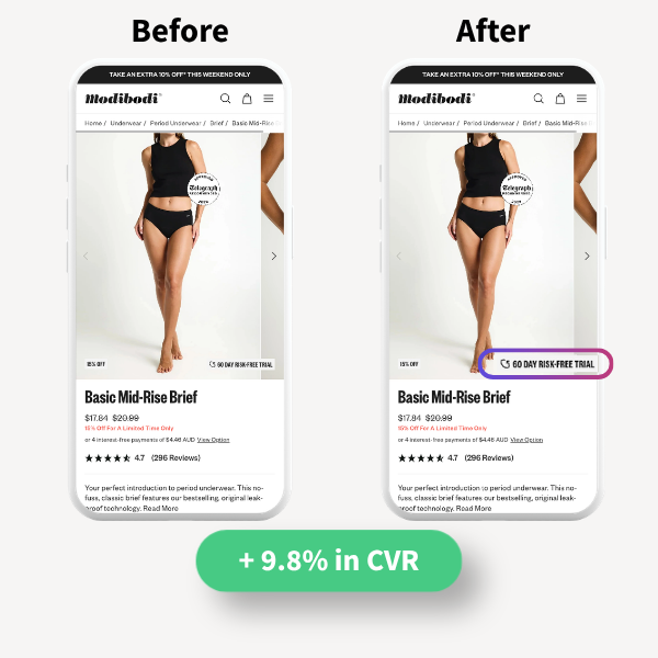
Modibodi knew they had one of the strongest return policies in the category: a 60-day trial for new customers. The theory was simple. If first-time shoppers felt that safety net upfront, they would be far more likely to convert.
So they brought it onto product pages for new customers only, using Visually’s personalization capabilities. The first version? Not a big win. But the team did not let it go. They iterated, reworked the design, and moved the message above the fold. That’s when the magic happened, and sales soared.
The result: +9.8% in conversion rate.
We started using Visually because it’s the strongest A/B testing platform out there, but we quickly realized its real superpower is personalization: once you test and learn what works, you can tailor it by audience and scale impact."
Justin Sommerville
CRO Specialist, TAG
Absorbency Clarity on PDP
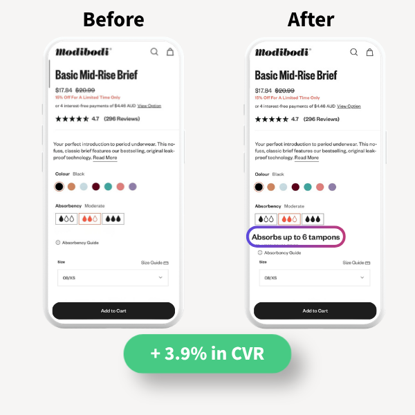
During competitor research, the team spotted a real problem: every brand uses its own absorbency scale, so “moderate,” “super,” and “ultra” mean something different everywhere and shoppers don’t know what to trust. And when shoppers feel unsure, conversion rates take the hit.
Their fix was elegantly simple: translate absorbency into a universal language customers already understand, “X tampons worth” and place it prominently on the product page so shoppers see it upfront. Suddenly, the decision feels clear and intuitive, while also making the savings and sustainability benefits tangible.
The result: +3.9% in conversion rate.
How it Works - New Users Only
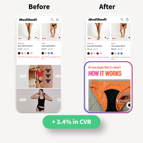
By the time the team planned this experience, earlier A/B tests had already made one thing clear: Even though period underwear has been around for years, many first-time shoppers still feel unsure, so for Modibodi, education is a core conversion driver.
Building on those wins, they added a “How It Works” section to answer common questions before they turn into drop-offs. The key was applying the insight precisely: placing it relatively high on the homepage for visibility, but showing it to new users only, powered by Visually’s personalization, so returning customers weren’t slowed down.
The result: additional 3.4% conversion rate uplift.
.png?width=600&height=600&name=Benchmade%20-%20Cart%20Messaging%20(1).png "Cart icon")
Cart Icon
Being data-driven, TAG turned to Google Analytics to understand where shoppers were falling off. After a full-funnel analysis, they noticed the Cart to Checkout drop was significant enough to require attention, signaling unnecessary friction at a critical step.
They explored several sophisticated hypotheses and solutions, alongside a simple thought: maybe shoppers simply forget about items in their cart, and a more prominent cart icon could help. It was nearly dismissed due to low expected impact, but it ended up being the surprise winner. They replaced the subtle orange dot with a full orange cart icon that also shows the item count.
The result: +5.6% in checkout rate.
That’s what I love about CRO and experimentation: it strips out bias and opinion and puts real evidence at the top. Merchandise tactics that work for one audience won’t always work for another, so no matter what you think you know, you have to test it. And with Visually, testing takes minutes, even faster with their new AI component, so there are no excuses."
Justin Sommerville
CRO Specialist, TAG